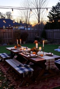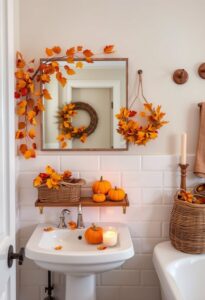
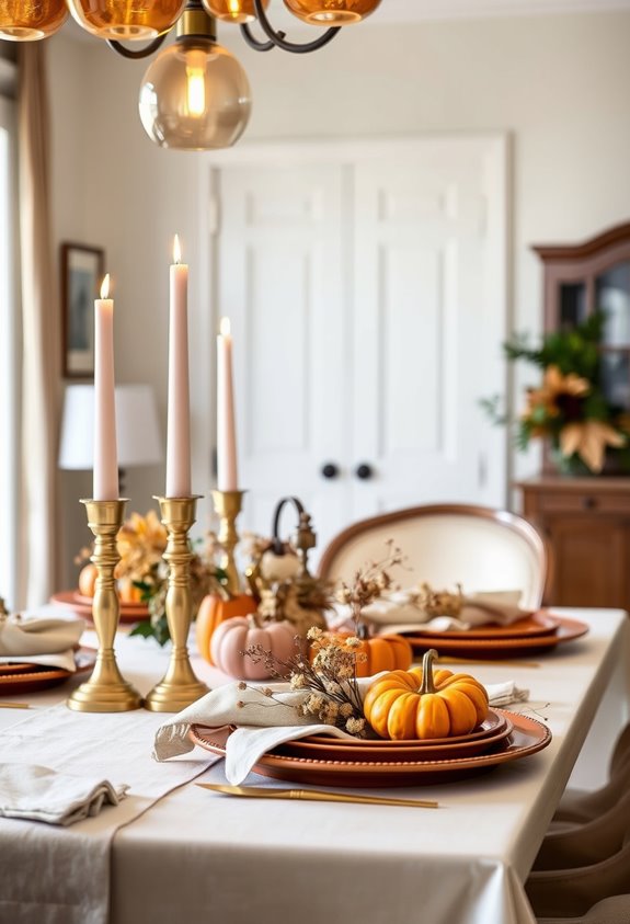
Magazine-worthy Thanksgiving tables aren’t magic—they’re just planned. You’re picking jewel tones or muted cool palettes, layering runners over tablecloths, and stacking three plates per setting like a stylist would. Centerpieces stay low, candles come in odd-number groupings, and metallics catch the candlelight. You pre-set everything the night before so the holiday isn’t chaos. These aren’t secrets, really—they’re just deliberate choices most people skip. The full breakdown ahead changes how you’ll approach every detail.
Start With a Color Palette That Sets the Mood
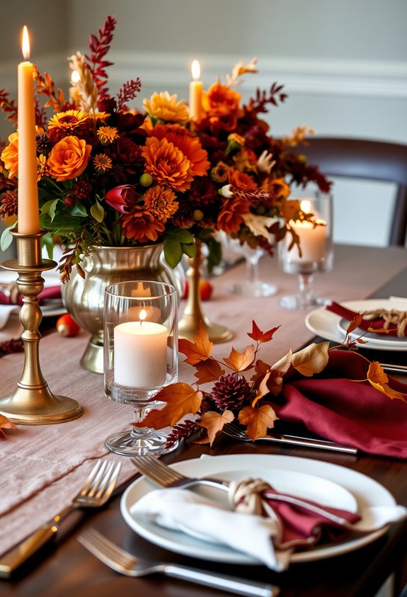
Choosing your color palette is the first real decision that separates a forgettable Thanksgiving table from one worth photographing. Skip the tired brown-and-orange combo if it doesn’t excite you. Jewel tones like indigo, aubergine, and emerald create something richer, more unexpected. Want calm? Muted cool tones like gray and teal keep things visually quiet so your food does the talking.
Here’s what most people miss: contrast matters. Pair cool hues with earthy tones deliberately, or your table falls flat. Full stop.
Classic fall colors still work, obviously. But blush pink with navy? Deep burnt orange with forest green? Those combinations feel current without trying too hard. Pick a palette that feels like *you*. That’s what makes a table feel intentional rather than assembled in a panic. For a bold, unexpected direction, plum and yellow use complementary positioning on the color wheel to create striking contrast that feels both eclectic and intentional.
How Do You Plan a Thanksgiving Table That’s Beautiful and Functional?
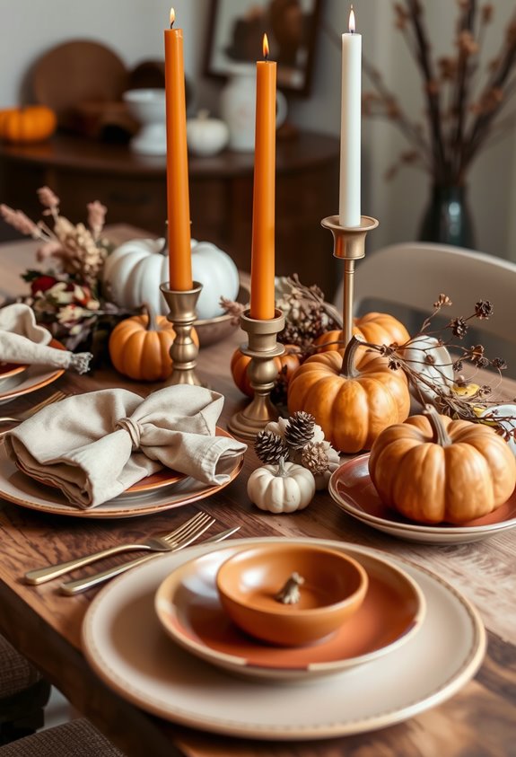
Planning a beautiful Thanksgiving table starts with one unglamorous reality check: how many people are actually sitting down? Count your guests first. Everything else follows from that number — chairs, plates, glasses, serving dishes. All of it.
Once you’ve got your headcount, measure your table. Seriously. Plates, glassware, and a centerpiece eat up surface space faster than you’d expect. If one table can’t hold everyone comfortably, add another early. Don’t wait.
Keep centerpieces under 12 inches so people can actually see each other. Test the height from a seated position before guests arrive. And here’s the part people skip: sit down during setup. Verify nothing’s crowding elbows or blocking reach.
Beautiful and functional aren’t opposites. They just require you to plan in the right order. A natural-colored linen tablecloth gives you a neutral, elegant foundation that works with virtually any decorative direction you choose to layer on top.
Pick a Tablecloth or Runner That Anchors Your Thanksgiving Table
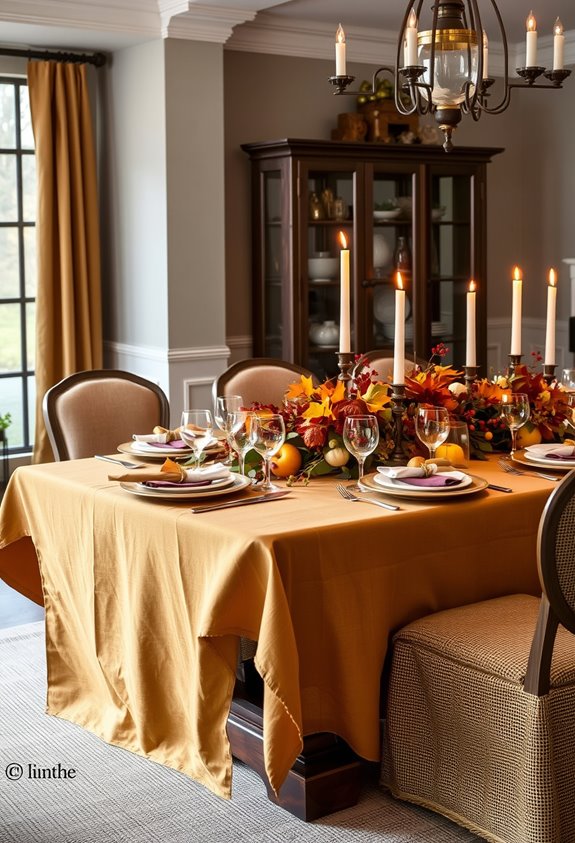
Once you’ve sorted out how many people are squeezing around your table and whether everyone can actually reach the green bean casserole, it’s time to deal with what’s underneath all of it. Your tablecloth or runner isn’t just background noise. It’s the foundation everything else sits on, literally.
A full tablecloth creates a more dressed-up look. A runner keeps things casual but still intentional. Neither works if the fit is wrong. Too small? Pick something else. Too large? Fold carefully, but keep folds away from plates.
Fabric matters too. Linen looks sharp but needs ironing. Polyester blends resist wrinkles. Cotton’s easy to wash. Heavier textiles hang better and feel less flimsy.
Color-wise, neutrals and deep autumn tones both work. Just make sure it matches the vibe you’re going for. Table runners are typically available in three sizes, so measure your table before committing to one.
Layer Textiles to Add Depth to Your Thanksgiving Table
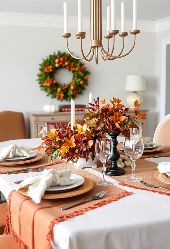
Layering textiles is where a table stops looking like a cafeteria setup and starts looking like something worth photographing. Start with a centered linen base — it sets a warm tone without screaming “formal dinner.”
Layering textiles is what separates a cafeteria table from one worth pulling out your phone for.
Then add a runner lengthwise down the middle. Boom. Instant depth.
Here’s what most people skip: texture contrast. Pair smooth ceramics with woven chargers. Mix matte finishes with a little shine. Combine wood tones with soft linen. These combinations create micro-shadows that make everything look more intentional.
Placemats come before dinnerware. Always. Stack a charger, dinner plate, salad plate, and you’ve built a place setting with actual dimension.
Keep your color family tight — creamy whites, soft greys, charcoal. Cohesion is what separates “pretty table” from “magazine cover.” For an editorial twist, try layered crossing runners — two narrow runners arranged in a T-shape to instantly elevate the foundation of your entire tablescape.
How Do You Build a Centerpiece Without Blocking Conversation?
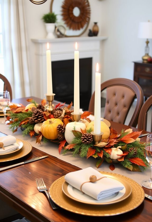
Now that your textiles are sorted, let’s talk about the thing that can make or break your whole setup — the centerpiece. Keep it low. That’s it. That’s the secret. Nobody wants to shout across a floral tower just to ask someone to pass the gravy.
Go wide instead of tall. Use a long tray, shallow bowl, or fabric runner as your base, then layer in gourds, mini pumpkins, and dried hydrangeas. Start with the big pieces first, then scatter smaller items around them. Cut any fresh stems short. Water-filled containers keep cuttings alive without needing height.
Add candles, but give them breathing room and use enclosed glass holders near foliage. The goal? Abundant, not crowded. Your table should feel full — not fenced off. Taper candles running down the center of the table are considered the most important component of a DIY centerpiece.
Add Metallics and Glass to Catch the Candlelight
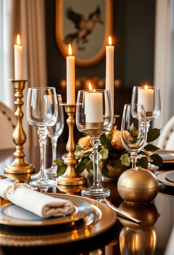
With your centerpiece sitting low and your candles ready to go, the next move is metallics and glass.
These two materials do one thing really well—they catch light and throw it back across the table.
Gold chargers, brass cutlery, mercury glass votives, copper accents.
Small details, big payoff.
Here’s the part most people miss: you don’t need matching metals.
Gold, copper, and silver can absolutely coexist.
In fact, mixing them looks more intentional, not less.
Lay them over a linen runner or white placemats and suddenly everything reads as polished instead of chaotic.
Glass works the same way.
Clear vessels, amber glasses, gold-rimmed stems—they scatter candlelight without adding visual weight.
Keep your base neutral.
Let the metallics and glass do the heavy lifting. Try metallic-painted faux pumpkins to seamlessly tie your metal accents into the centerpiece without spending much at all.
Mix Candle Heights for Warmth and Visual Drama
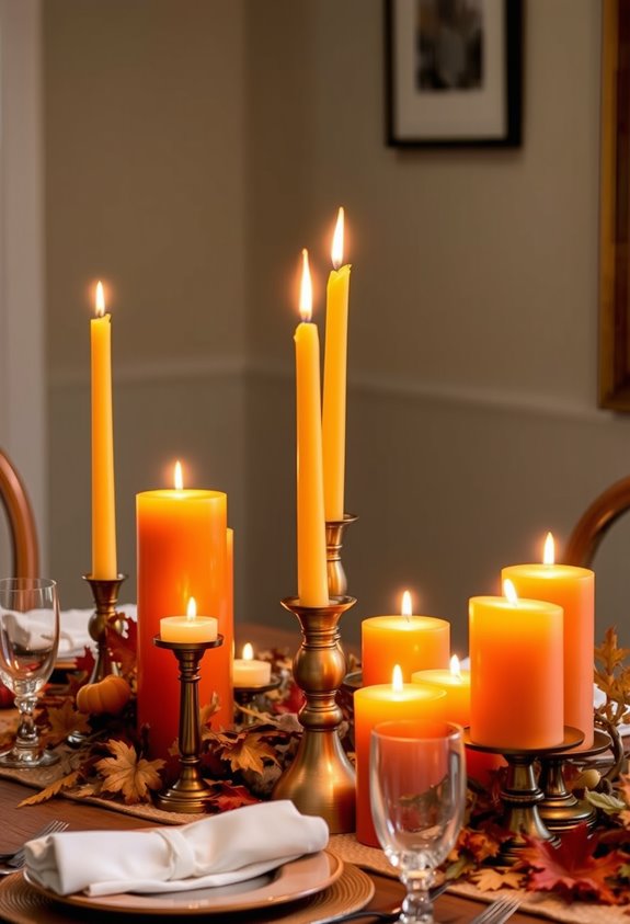
Stagger your candles and the whole table comes alive. It’s not magic. It’s math — odd numbers and mixed heights working together. Group your candles in threes, fives, or sevens. Seriously, even numbers just sit there looking stiff and forgettable.
Odd numbers aren’t just a suggestion — they’re the difference between a table that breathes and one that doesn’t.
Short votives around 2–3 inches, medium pillars at 4–6 inches, tall tapers pushing 8–12 inches — that combination builds a visual pyramid that pulls everyone’s attention upward. The layered lighting feels warmer. More three-dimensional. Like the table actually has depth.
Keep taller candles away from eye level so nobody’s squinting across the centerpiece mid-conversation. Seated guests have sightlines around 24–30 inches above the table surface — respect that.
Cluster candles near edges when needed. Uneven spacing beats perfect alignment every time. Your table should feel intentional, not catalog-flat. Taller candles draw the eye upward while shorter arrangements naturally fill the space around displays without competing for attention.
Use Woven Linens, Greenery, and Fruit to Ground the Seasonal Look
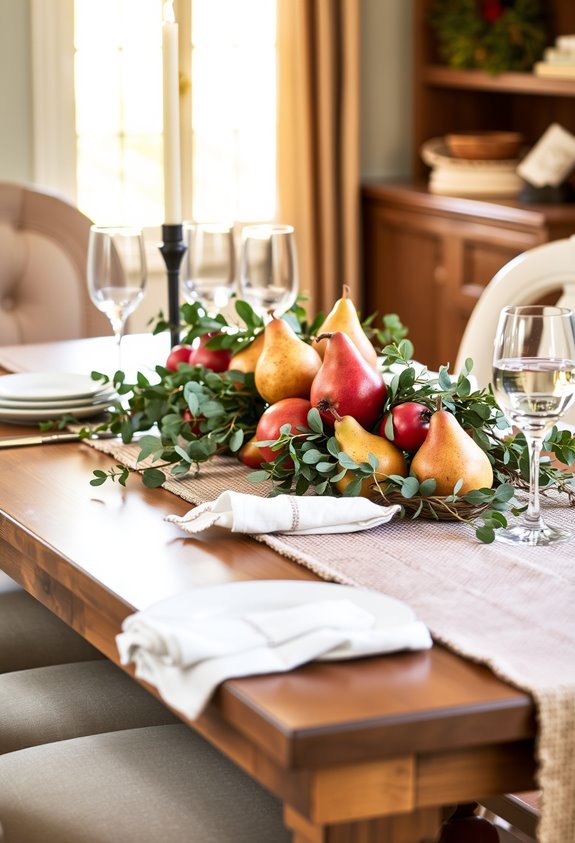
Beneath your centerpiece, the table itself has to earn its place. Start with a woven cotton or jacquard linen in gold, russet, burgundy, or sage. Those colors aren’t random — they’re the harvest palette, and they work. The weave adds texture and structure without trying too hard.
Layer a runner over a tablecloth if you want depth. Then add greenery. It softens everything. Irregular leaf shapes break up the stiffness of folded napkins and stacked plates in a way that feels intentional.
Finally, bring in fruit. Real or faux, it doesn’t matter. Fruit signals abundance. It tells a story faster than any decorative object can. When all three elements share that organic, earthy language, the table stops looking assembled. It looks lived-in and intentional.
Stack Your Place Settings Like a Professional Stylist
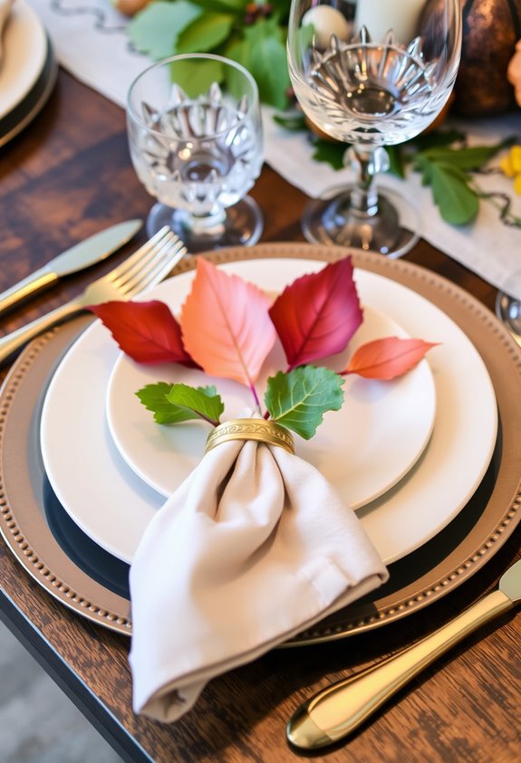
The plate stack is where most people quietly give up. Don’t. Start with a charger or placemat, then layer the dinner plate on top, then the salad plate or bowl. That’s it. Three layers, instant polish.
White plates are your best friend here because they let everything else do the talking — color, texture, seasonal accents. Simple works. Mixed materials work even better. Ceramic with wood accents or metallic details creates contrast without turning your table into a craft fair explosion.
Editorial tables you’ve seen in magazines? They’re just stacked layers of formal china, glassware, and silverware arranged deliberately. You’re not reinventing anything. You’re just finally doing it right. Depth is the difference between a table that looks styled and one that looks forgotten. To finish each place setting with intention, use monogrammed linen napkins to add elegance while naturally guiding guests to their seats.
Set Your Thanksgiving Table the Night Before for a Stress-Free Holiday
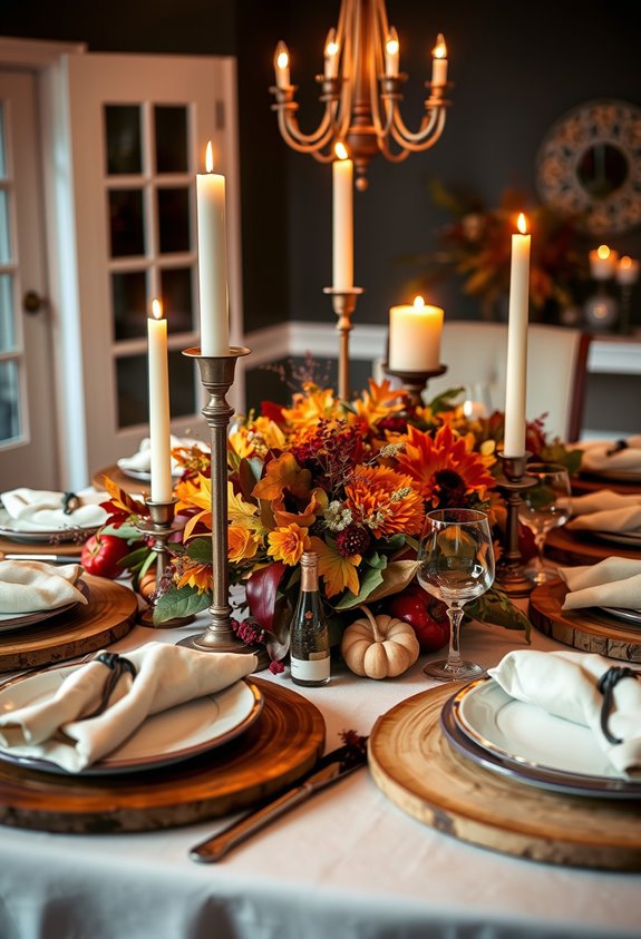
Now that your place settings are stacked and looking like something out of a catalog, here’s where smart hosts separate themselves from the stressed ones: do it the night before. Seriously. Set out your plates, flatware, glassware, napkins, and candles the evening before Thanksgiving.
Done.
Start with the tablecloth, then layer in placemats, plates, and glasses. Pre-stage your serving dishes so you can check spacing before the food ever arrives. You’ll quickly spot if things are too crowded. Fix it now, not at 2 p.m. on Thursday.
Test whether the full menu fits without chaos. Keep the center clear for the turkey and platters. Fold napkins early. Place candles safely.
Tomorrow, you walk in calm. Place your kraft paper table runner down as a budget-friendly base that guests can even write on. Your guests don’t need to know how easy it actually was.
Frequently Asked Questions
Can Outdoor Thanksgiving Tables Follow the Same Styling Secrets Indoors?
Yes, outdoor Thanksgiving tables follow the same four styling pillars: anchor, layers, height, and sparkle. Nearly 70% of entertaining experts agree outdoor settings fail simply because people abandon their indoor instincts. Don’t do that. You still need a strong foundation, layered textures, and reflective accents.
The difference? Weather-aware swaps. Swap delicate linens for sturdy materials, skip scented candles, and add fresh elements last. Same secrets. Smarter execution.
What Budget Range Should You Expect for a Magazine-Worthy Table Setting?
You don’t need a trust fund. A solid magazine-worthy table starts around $50 if you’re strategic.
Hit $50–$150 and you’re getting real cohesion — linens, chargers, candles.
$150–$300 frees that fuller, editorial feel with mixed textures and better centerpieces.
$300-plus? That’s where scale and density take over. Here’s the blunt truth: budget matters less than layering, color consistency, and intentional placement. Anyone can pull this off.
How Do You Style a Thanksgiving Table for a Very Small Space?
Small space? No problem. Keep your centerpiece under 12 inches so everyone can actually see each other.
Swap one giant floral arrangement for a few small bud vases staggered down the middle. Add mixed-height candles for dimension without eating up space.
Toss in mini pumpkins or seasonal fruit for that harvest feel. Less is genuinely more here. Edit ruthlessly, and your table instantly looks polished, intentional, and way more inviting.
Are There Child-Friendly Table Setting Options That Still Look Elegant?
Yes, absolutely.
Like a tiny seat at the big table, kids deserve to feel included *and* celebrated.
Swap in melamine plates — they mimic real china without the drama. Add battery-operated candles for ambiance, minus the burn risk. Mini pumpkins, coloring placemats, and name cards pull everything together beautifully.
One glass per setting — not two.
Keep it simple, intentional, and styled. Elegant doesn’t mean fragile. It means thoughtful.
How Do You Adapt These Styling Tips for a Round Dining Table?
Round tables? They’re actually easier to style than you think.
Keep your centerpiece under 12 inches tall — nobody wants to talk to a floral arrangement.
Stick to one strong focal point in the center, then repeat smaller elements around the circle for balance.
Skip the rectangular runner; use a circular linen base instead.
Keep place settings compact.
Leave room for serving dishes.
Symmetry is your best friend here.