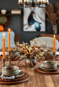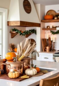
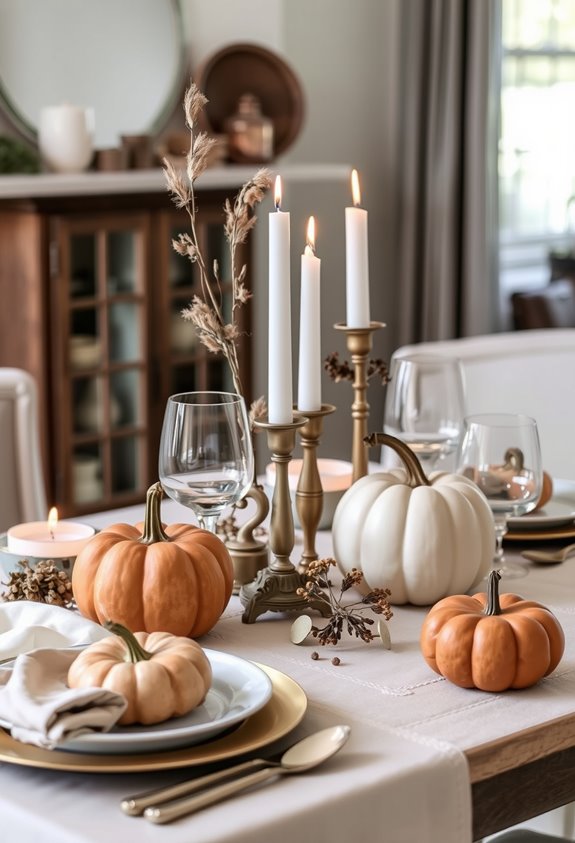
Neutral Thanksgiving palettes are taking over in 2026 because people are done with decor that screams louder than the actual food. Warm browns, taupes, creams, and sage have replaced the old orange-and-burgundy playbook entirely. They photograph better, coordinate effortlessly, and create genuine warmth without looking like a seasonal costume. They also carry straight into winter without a full decor overhaul. The eight examples ahead show exactly what that shift looks like in practice.
Why Everyone Is Decorating Thanksgiving in Neutrals This Year
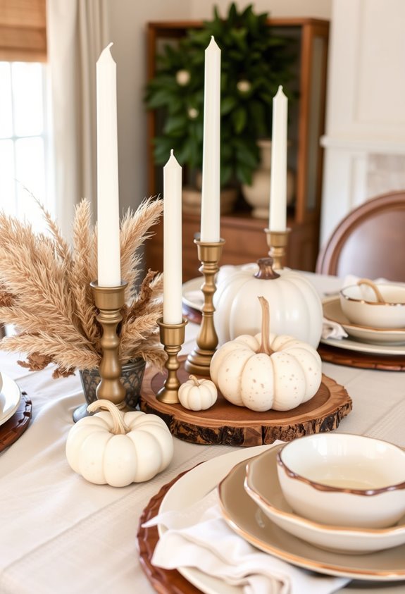
Minimalism isn’t just a design phase anymore — it’s fully taken over Thanksgiving. And honestly? You’re not alone if your harvest-orange tablescape suddenly feels exhausting. Everyone’s moving toward neutrals, and there’s a real reason for it.
The 2026 interior design world is pushing hard toward calm, harmony, and softness. Saturated colors are out. Warm neutrals are in. Design forecasters describe the shift as colors that *accompany* natural light instead of fighting it. Makes sense, right?
Thanksgiving decor is following that exact current. Neutral palettes aren’t boring — they’re intentional. They coordinate easily, photograph beautifully, and feel unified without trying too hard. The look is light, airy, and harmonious.
You’re not chasing a trend. You’re joining a broader design moment that finally makes the holiday table feel like home. Materials like travertine and soft limestone are being used across interiors and outdoor spaces to create visual continuity between living areas, and that same principle of seamless, unified aesthetics translates beautifully to a neutral Thanksgiving table.
Warm Browns and Taupes That Anchor a Neutral Thanksgiving Palette
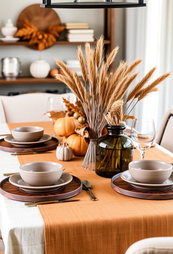
If you’ve ever wondered why brown keeps showing up everywhere in 2026 interiors, there’s a real answer. Brown is the new black. Designers aren’t being dramatic — they’re being deliberate. Warm brown anchors a room without stealing the show, letting furniture, art, and finishes do their thing.
Then there’s taupe. Think of it as brown’s more refined sibling. It carries beige warmth but hits harder. Moodier. More grounded. Taupe even brings subtle violet or red undertones that add dimension you didn’t know you needed.
For Thanksgiving specifically, these two neutrals are doing heavy lifting. They create a backdrop that supports cranberry, harvest wheat, and aged brass without screaming “seasonal decor.” The result feels collected. Sophisticated. Like your space has actual personality. When taupe takes on jewel tone pairings, it shifts from quiet background player to something genuinely luxurious.
Creams and Beiges That Feel Cozy, Not Bland
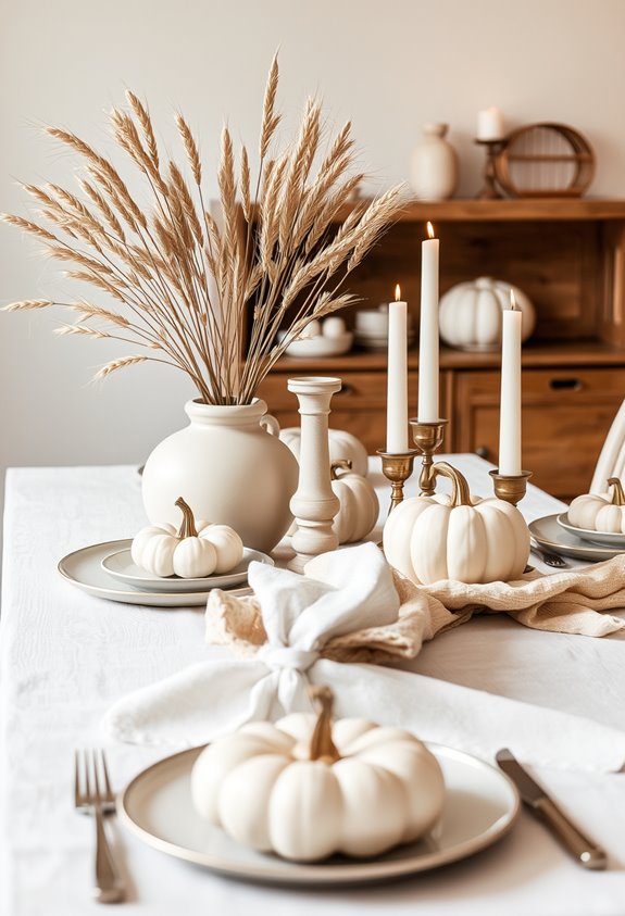
Beige is back. And honestly? It never should’ve left. In 2026, cream and beige aren’t boring fallbacks — they’re the sophisticated anchor your Thanksgiving table’s been missing. These tones create warmth without visual chaos. That matters.
Beige isn’t boring — it’s the warm, grounding anchor your Thanksgiving table has always needed.
The secret is texture. Linen napkins, plaid blankets, wooden surfaces — these are what separate a cozy, intentional neutral table from a sad, empty one. Glassware and simple white plates keep everything cohesive while letting the textures breathe.
Add pumpkins, pine cones, or dried botanicals and suddenly your beige palette feels deeply seasonal. Earthy, tonal, harvest-ready. Cream and beige stay close to the natural fall landscape, so the whole thing just *works* together. For linens, options like Nora Celadon and Velvet Hazelnut translate these cozy neutral tones beautifully into fabric choices that feel both seasonal and refined.
Neutral doesn’t mean plain. It means you know what you’re doing.
Sage, Moss, and Eucalyptus as the New Thanksgiving Neutral
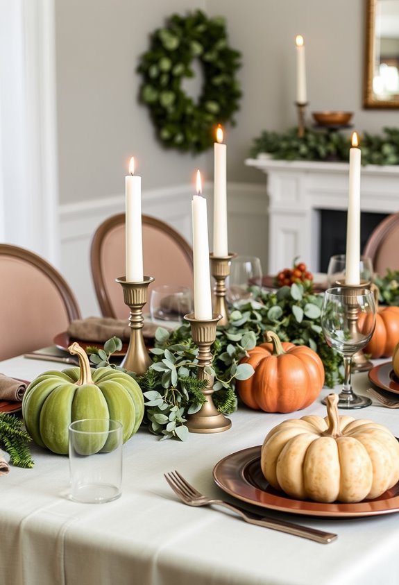
While beige was busy being beige, green quietly became the new neutral. Sage, moss, and eucalyptus are no longer “accent colors.” They’re replacing cooler grays and greiges entirely, and designers aren’t apologizing for it.
Here’s why it works for Thanksgiving specifically. These greens echo late fall naturally — think eucalyptus, stone, wood, pottery. They pair effortlessly with linen, brass, and ceramic, which are already staples on most Thanksgiving tables. The palette creates contrast through texture and undertone, not through loud color fights.
And the vibe? Cozy, modern, timeless. Not costume-like. That matters.
2026 neutral trends are built around comfort and connection. Warm greens deliver both without screaming “seasonal decor.” Subdued saturation and warm undertones do the heavy lifting. Quietly. Effectively. No orange-and-brown pile-up required. Shades like Valspar’s Warm Eucalyptus are already being used on living room walls, proving these tones work far beyond a single season.
How to Layer Neutral Thanksgiving Colors Without Losing Visual Interest
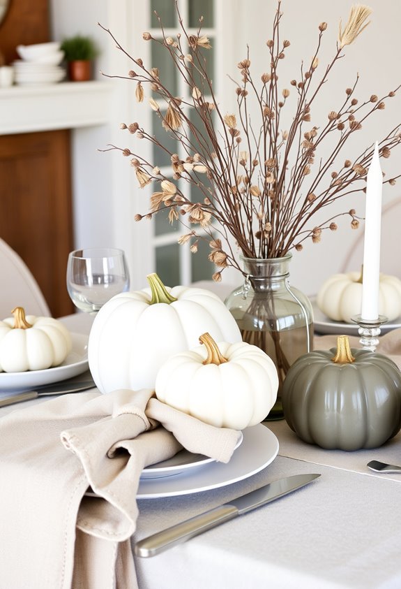
Choosing sage, moss, or eucalyptus as your base already puts you ahead. But a flat, one-note table? That’s where people lose the room. Layering is everything here.
Start with your neutrals, then mix light and dark shades within that same family. Cream against brown. Soft gray beside muted olive. Contrast doesn’t have to scream — it just has to exist.
Texture does the heavy lifting when color stays restrained. Linen napkins, a burlap runner, a chunky knit throw nearby. These aren’t decorating extras. They’re the whole point.
Then add one accent color — burgundy, rust, or matte gold — and repeat it in two or three spots. Candles, glassware, napkin rings. Repetition creates intention. And intention is what separates a real table from a lucky accident. For a grounded yet cohesive look, the teal and gray combination pairs especially well with the natural tones already present in your Thanksgiving spread, from pumpkin pie to roasted turkey.
Neutral Tablescapes That Let the Meal Take Center Stage
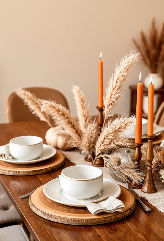
The whole point of a neutral tablescape is to get out of the way. Your table setting isn’t the star. The food is. Glazed mains, roasted vegetables, golden breads — they already bring rich color and strong contrast. A busy, loud table competes with all of that. Why would you do that?
Simple, understated place settings let the meal breathe. Clean lines and soft neutral tones keep the visual focus exactly where it belongs. Minimalist tablescapes are making a real comeback in 2026 for exactly this reason.
The goal is a table that feels present without overshadowing what everyone actually came for — the food. Neutral decor stays “pretty rather than playful.” That’s not a limitation. That’s the whole strategy. Warm clay, smoky taupe, and sandstone tones pair beautifully with natural elements like wood and rattan to create an atmosphere that feels grounded and authentically warm without ever competing for attention.
Metallics, Textures, and Botanicals That Accent Without Overpowering
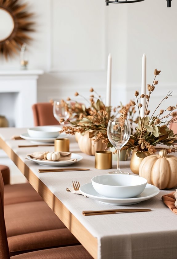
Metallics, textures, and botanicals do the heavy lifting once your neutral foundation is in place — but only if you don’t overdo it.
Brushed gold and matte bronze add warmth without screaming “look at me.” Copper shows up everywhere — candle holders, vases, cutlery — and honestly, it earns its spot. Mix your metallics carefully against cream or beige, and you get depth. Overdo it, and you’ve got a disco table. Nobody wants that.
Mix metallics with intention. Depth comes from restraint — not from piling on every shiny thing you own.
Texture matters too.
Linen, chunky knit, woven placemats — they keep beige from looking boring. Candlelight does the rest, adding glow and movement across muted surfaces.
Then there’s the botanicals.
Eucalyptus, pampas grass, dried florals. They anchor the whole thing. Keep them restrained. Small quantities. Intentional placement. That’s what separates styled from cluttered.
Neutral Thanksgiving Pieces That Carry Straight Into Winter
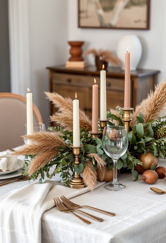
Spending money twice on seasonal decor is optional — and honestly, kind of unnecessary. The whole point of going neutral is that your pieces keep working after the turkey’s gone. Linen runners in cream or warm gray don’t scream Thanksgiving. They just look good. Same with pinecones, wooden bowls, and eucalyptus wreaths — they belong to late fall *and* winter equally. Swap orange blooms for white ones. Done. Your centerpiece just crossed into December without breaking a sweat.
Ceramic vases hold fall stems now, evergreen stems later. Glass hurricanes just need a different fill. That’s it. No storage bins. No replacement haul. The people who figured this out aren’t decorating smarter by accident — they chose pieces that never needed replacing in the first place.
Metallic accents in copper, gold, and antiqued silver thread through both holidays without missing a beat. Warm metallic accents like copper votives and gold-rimmed pieces don’t belong to Thanksgiving or Christmas specifically — they belong to the whole season, which is exactly what makes them worth buying once and keeping forever.
Frequently Asked Questions
Can Neutral Thanksgiving Decor Work in Small Apartments or Compact Dining Spaces?
Yes, neutral Thanksgiving decor absolutely works in small apartments. It’s practically made for tight spaces.
Stick to three to five colors max — your room won’t feel chaotic. Use mini pumpkins, low centerpieces, and taper candles instead of bulky arrangements. Keep sightlines open across your dining table. Bonus: neutral pieces like vases and candles pull double duty across seasons, which matters when you’ve got zero storage.
Small space, big impact.
Are Neutral Thanksgiving Palettes Budget-Friendly Compared to Traditional Holiday Color Schemes?
Someone pulled off a full neutral Thanksgiving tablescape for eight people on just $100. That’s not luck — that’s smart.
Neutral palettes can absolutely save you money because you’re reusing the same whites, beiges, and wood tones year-round instead of buying fresh orange-and-brown everything annually.
But here’s the blunt truth: if you’re eyeing linen, brass, and ceramics, costs climb fast. Reuse is where the real savings live.
Which Neutral Thanksgiving Shades Photograph Best for Social Media and Holiday Cards?
Cream, beige, and taupe photograph beautifully for both social media and holiday cards. They’re warm, cohesive, and won’t fight your fall backdrop.
Ivory reads cozy, not cold. Latte and mocha tones? Chef’s kiss for portraits. Pair them with sage or soft gray accents for depth.
Skip bright white — it looks stark against autumn settings. And neon anything? Hard pass. It’ll cast weird tones on skin. Stick to warm, muted neutrals. You’ll thank yourself later.
Do Neutral Palettes Work Equally Well for Both Formal and Casual Thanksgiving Settings?
Yes. And here’s what makes that surprising. The *same* neutral palette — cream, beige, gray, brown — can feel completely different depending on what you pair it with.
White dinnerware and glassware? Suddenly formal. Swap in wood, clay, and greenery? Instantly casual. You don’t need two separate tablescapes. One base does both. That’s not a coincidence — it’s exactly why neutrals are dominating. Versatility isn’t a trend. It’s a strategy.
Can Children’s Thanksgiving Table Settings Follow a Neutral Palette Successfully?
Yes, children’s tables can absolutely pull off a neutral palette. Cream plates, tan napkins, wooden chargers — it all works together without looking boring. Neutrals actually hide spills better than bright colors. Shocking, right?
You can layer in texture through woven placemats or kraft paper runners to keep things interesting. Add small seasonal touches like mini pumpkins or leaf-shaped name tags. The result feels cozy, cohesive, and surprisingly sophisticated for a kids’ table.