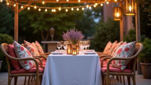
To create a cohesive year-round holiday decor scheme, start with versatile core colors like metallic neutrals (gold, silver, copper) and nature-inspired greens and browns. You’ll want to layer in seasonal accent colors – warm reds and golds for autumn, cool blues and silvers for winter, soft pastels for spring, and vibrant hues for summer. Using white or cream as a base canvas helps shift between seasons smoothly, while thoughtful metallic touches add elegance throughout the year. The perfect palette awaits as you explore each season’s magical possibilities.
Design Highlights
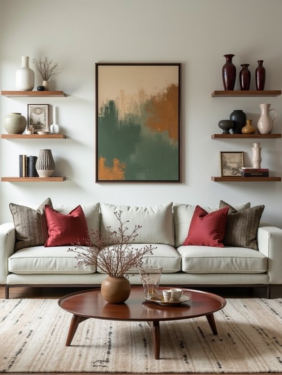
- Select metallic neutrals like gold, silver, and copper as base colors that seamlessly transition between holidays while maintaining elegance.
- Combine traditional holiday colors with modern counterparts, using deep burgundy and navy as versatile year-round anchors.
- Layer seasonal accent colors over neutral foundations of white, cream, or nature-inspired greens for easy holiday transitions.
- Use coordinated cotton hand towels and throw pillows in seasonal colors to create cohesive decorative themes throughout the year.
- Incorporate transitional color combinations, like blending late-season hues with upcoming holiday palettes for smooth seasonal flow.
Understanding the Psychology of Seasonal Colors
While many people naturally gravitate toward certain colors during different seasons, there’s actually fascinating science behind why we’re drawn to specific seasonal palettes. Your brain processes colors differently throughout the year, responding to both environmental changes and cultural associations.
Colors shape our seasonal preferences through complex biological and cultural factors, making our attraction to specific palettes a fascinating intersection of science and psychology.
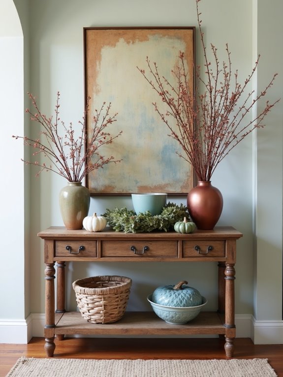
You’ll find that warm reds and golds in autumn decorations can create feelings of coziness and comfort, helping your guests feel welcome during harvest gatherings.
Cool winter blues and silvers often evoke a sense of peace and tranquility, while spring’s soft pastels can lift spirits and inspire hope. Understanding the importance of material durability can also enhance your seasonal decor choices, ensuring they remain beautiful and functional throughout the holidays.
When you understand these color connections, you can create more meaningful spaces that resonate with your visitors emotionally. By choosing colors thoughtfully, you’re not just decorating – you’re crafting experiences that touch hearts and create lasting memories.
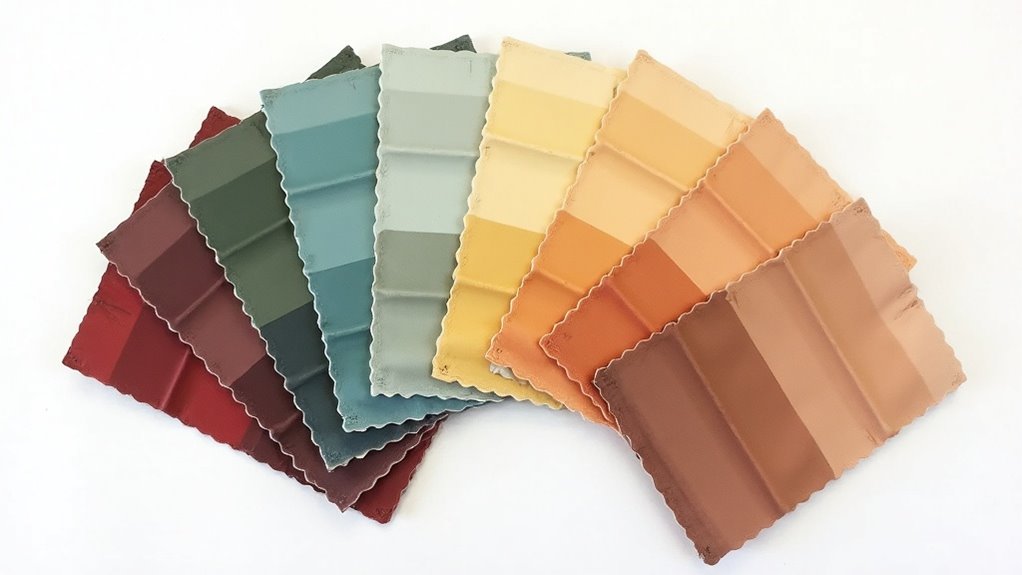
Core Color Palettes for Year-Round Celebrations
Throughout the year, you’ll discover a set of timeless color combinations that can transform your home into a festive haven for every celebration.
These versatile palettes create the perfect backdrop for gathering loved ones and making cherished memories.
The key to successful year-round decorating lies in choosing adaptable color combinations that work beautifully across seasons:
- Metallic neutrals (gold, silver, and copper) pair wonderfully with any seasonal accent color, adding warmth and sparkle to your space.
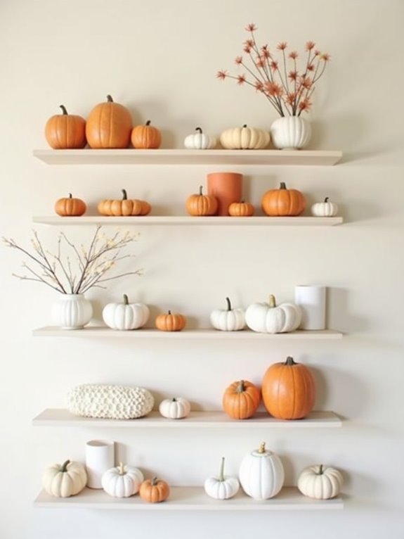
- Nature-inspired greens and browns serve as a foundation that shifts smoothly between celebrations.
- White and cream create a clean canvas that lets your accent colors shine while maintaining elegance.
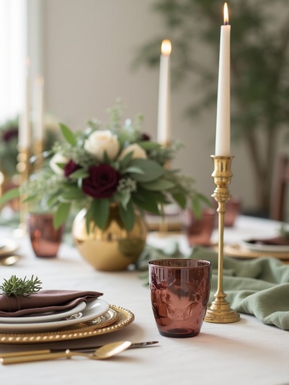
- Deep navy and rich burgundy offer sophisticated options that complement both warm and cool color schemes.
- Incorporating metallic accents can enhance elegance and atmosphere, making your decor feel both modern and inviting.
These timeless choices will help you create welcoming spaces for every special occasion.
Transitional Color Combinations Between Seasons
Moving gracefully from one season to the next doesn’t mean you have to completely overhaul your decorative color schemes. Instead, you’ll find that many colors can bridge the gap between seasons, creating a smooth and budget-friendly changeover for your home.
Try pairing late summer’s rich purples with autumn’s warm oranges, or blend winter’s deep blues with spring’s fresh mint greens. You can easily shift from fall to winter by keeping your copper and bronze elements while adding touches of silver and white.
As spring approaches, incorporate softer versions of your winter colors – think dusty blue fading into pastel aqua. When summer returns, transform spring’s soft yellows into vibrant sunshine hues while maintaining gentle green accents. Additionally, consider using shamrock patterns in your seasonal decor to add a festive touch during celebrations.
These thoughtful changes will help you create welcoming spaces that evolve naturally throughout the year.
Incorporating Metallic Accents Throughout the Year
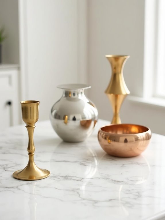
Metallic accents serve as the perfect year-round decorating secret, adding sparkle and sophistication to any seasonal color palette.
You’ll find that incorporating metallic elements into your holiday décor creates a timeless elegance that shifts smoothly from one celebration to the next.
Whether you’re hosting a family gathering or preparing for a neighborhood party, these versatile touches will make your space feel extra special.
- Mix silver and gold together during winter holidays for a luxurious feel that carries through New Year’s celebrations.
- Add copper and bronze tones in autumn to complement warm harvest colors.
- Incorporate rose gold in spring to enhance soft pastels and floral arrangements.
- Use bright metallic finishes in summer to catch natural light and create a cheerful atmosphere.
- Consider using durable decorations that can withstand various weather conditions, ensuring your metallic accents shine regardless of the season.
Creating Multi-Holiday Color Schemes That Flow
When you’re planning your home’s decorative flow throughout the year, you’ll want to create color schemes that shift smoothly from one holiday to the next. By choosing versatile colors that complement each other, you’ll create a welcoming atmosphere that’s easy to navigate between seasons.
| Season | Primary Colors | Secondary Colors |
|---|---|---|
| Winter | White, Blue | Silver, Ice Blue |
| Spring | Pink, Yellow | Lavender, Green |
| Summer | Blue, Green | White, Yellow |
| Fall | Orange, Brown | Gold, Burgundy |
| Winter | Red, Green | Gold, White |
Select colors that can work double-duty across holidays, like white, which works beautifully from winter through summer. You’ll find that metallic accents, especially gold and silver, can bridge the gap between seasons while adding elegant sparkle to your decor. This approach helps you create a cohesive look that’s both cost-effective and visually appealing. Incorporating durable materials ensures that your decorations can withstand seasonal changes while maintaining their vibrant appearance.
Strategic Color Planning for Adjacent Celebrations
Strategic planning becomes your best friend as you’re shifting between back-to-back holidays throughout the year. By selecting colors that gracefully shift between celebrations, you’ll create a welcoming atmosphere that feels intentional and harmonious.
Consider how your chosen palette can adapt and evolve through the seasons, making your decorating efforts both efficient and beautiful.
- Choose shifting colors that work for multiple holidays, like deep purple for both Halloween and Christmas.
- Keep base colors neutral, such as cream or silver, allowing accent colors to take center stage.
- Store decorations by color family rather than holiday to easily mix and match.
- Plan your color shifts at the start of each season, mapping out how one celebration will flow into the next. Additionally, consider incorporating coordinated cotton hand towels that can seamlessly blend into your seasonal decor.
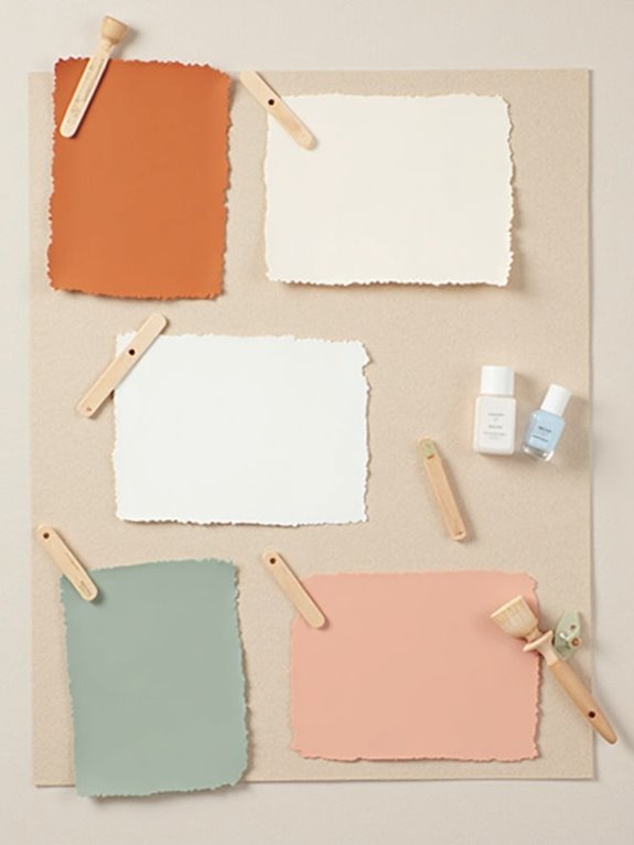
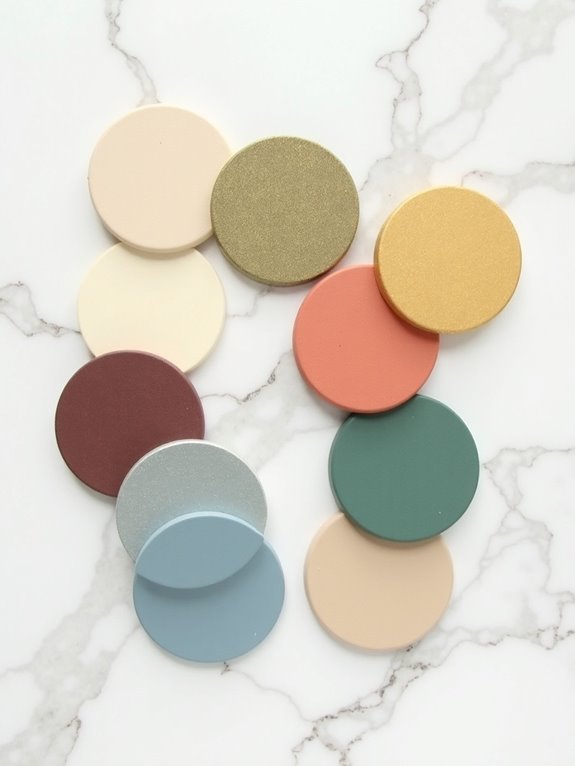
Blending Traditional and Modern Holiday Hues
Creating a fresh holiday aesthetic doesn’t mean you’ll need to abandon cherished traditional colors – instead, you’re about to discover the magic of blending old and new. By thoughtfully combining classic shades with contemporary hues, you’ll create spaces that feel both timeless and trendy.
| Traditional | Modern Twist | Perfect Blend |
|---|---|---|
| Forest Green | Sage | Botanical Mix |
| Ruby Red | Blush Pink | Berry Tones |
| Gold | Rose Gold | Metallic Fusion |
| Navy Blue | Ice Blue | Winter Waters |
When you’re ready to refresh your holiday palette, start with a beloved traditional color as your base. Then, introduce its modern counterpart in smaller doses through accent pieces, like throw pillows or ornaments. You’ll be amazed at how these thoughtful combinations can transform your space while honoring cherished holiday memories.
Frequently Asked Questions
How Do I Color-Match Existing Holiday Decorations With Newly Purchased Items?
You’ll want to bring one of your existing decorations with you while shopping, or take clear photos in natural light. This helps you match colors and finishes perfectly.
If that’s not possible, collect paint chips or fabric swatches that match your current items.
When shopping online, always check the product description for specific color names, and remember that metallic finishes (gold, silver, bronze) tend to be the easiest to coordinate.
What Cleaning Products Are Safe for Different Types of Holiday Decorative Materials?
You’ll want to match your cleaning products to each decoration’s material for the safest care.
For glass ornaments, use a gentle mix of warm water and mild dish soap.
Artificial greenery needs a light dusting with a soft cloth or feather duster.
For delicate fabrics like stockings, spot clean with gentle detergent.
Metal decorations shine best with a mixture of water and white vinegar, while wooden items need only a slightly damp cloth.
Can LED Lights Affect How Seasonal Color Palettes Appear in Photographs?
Yes, LED lights can greatly change how your seasonal colors look in photos!
Picture taking a photo of your beautiful burgundy and gold Christmas display, but your cool-white LED lights make everything appear bluish and washed out.
To capture true colors, you’ll want to use warm white LEDs or adjust your camera’s white balance settings.
Some photographers even bring traditional incandescent lights just for photo sessions to guarantee those rich, seasonal hues shine through perfectly.
Which Color Combinations Help Make Small Spaces Appear Larger During Holidays?
You’ll create a more spacious feel by using cool whites, silvers, and light blues as your main holiday colors.
These bright, reflective shades open up tight spaces and make rooms feel airier. Add small pops of deep red or green as accents, but don’t let them overwhelm.
Try placing metallic ornaments and mirrors strategically to bounce light around the room, and you’ll be amazed at how much larger your space feels during the festive season.
How Do Different Lighting Conditions Impact the Appearance of Seasonal Color Schemes?
Natural daylight will make your seasonal colors appear truest, while warm artificial lighting can enhance reds and golds, making them feel extra cozy.
You’ll notice that LED lights tend to make blues and silvers look more vibrant, perfect for winter themes.
In dim evening light, metallic accents really shine and add sparkle.
When you’re planning your holiday displays, try viewing your color combinations at different times of day for the best effect.
Conclusion
Your seasonal color journey‘s like a garden that blooms year-round, with each shade telling its own story through your decorations. You’ll find that these palettes aren’t just colors – they’re the threads that weave your celebrations together, creating a tapestry of memories throughout the year. As you embrace these harmonious combinations, you’re crafting spaces that flow naturally from one holiday to the next, making your home a canvas of continuous celebration.