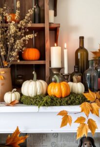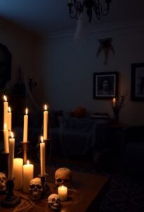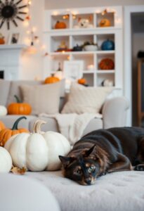
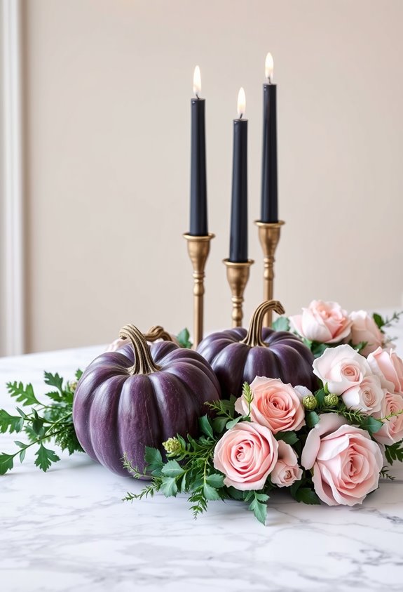
Orange and black aren’t bad — they’re just boring at this point. You’ve got better options: black and gold for a luxe, dramatic look; blush pink with rose gold for romantic gothic vibes; jewel tones like purple, teal, and burgundy for something rich and unexpected. Even white pumpkins with neutrals can feel spookier than a neon orange plastic jack-o’-lantern. There’s a whole color playbook waiting, and it’s smarter than you’d think.
Design Highlights
- Jewel tones like deep purple, teal, and burgundy replace traditional orange while maintaining Halloween’s dramatic, moody atmosphere.
- Hot pink and electric blue create bold, unexpected energy when grounded by black or white anchor elements.
- Luxe black and gold palettes blend glam with gothic, using gilded pumpkins and metallic accents for sophisticated spookiness.
- Earthy neutrals like cream, mustard, rust, and burgundy shift Halloween decor toward a warm, harvest-inspired aesthetic.
- Room-specific color schemes — gothic purples in bedrooms, chaotic neons in kitchens — create distinct, intentional chapters throughout your home.
Black and Gold Halloween Decor for a Luxurious Look
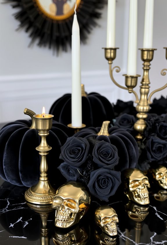
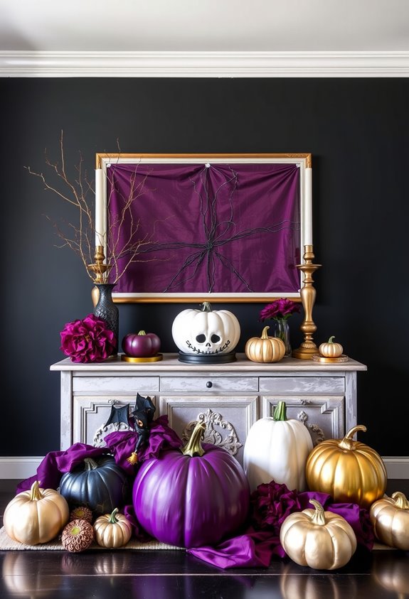
When it comes to Halloween color schemes, black and gold is in a league of its own. It’s glamorous, it’s polished, and it makes every other option look like it’s still in costume. Gold breaks up the darkness, adds shine, and creates contrast that actually holds your attention. We’re talking metallic candleholders, gold-rimmed glassware, gilded pumpkins placed next to matte black ones. The visual tension is the whole point.
This palette works across modern, minimal, vintage, and glam styles. It’s genuinely adaptable. Layer in velvet, lace, or metallic foil, and suddenly your space looks intentional, not just spooky. Gold-framed mirrors reflect light. Brass candlesticks add warmth. Black tulle adds edge. Together, they create something that feels curated rather than thrown together the night before.
For a finishing touch that costs almost nothing, try spray painting plastic bugs gold and pressing them onto a black backdrop for instant, eye-catching decor.
White Pumpkins and Neutrals for a Minimalist Halloween Aesthetic
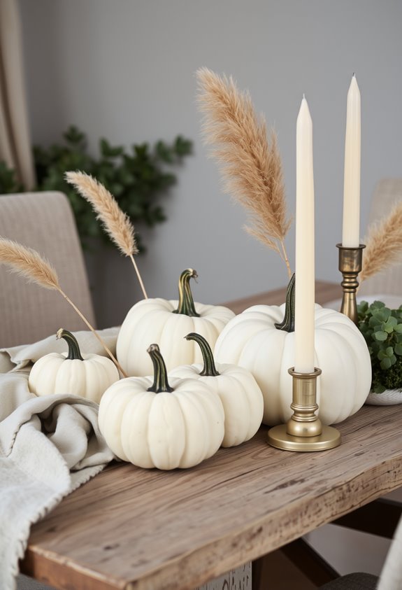
Black and gold is a hard act to follow, but white pumpkins don’t even try to compete — and that’s exactly the point. They’re not here to impress. They’re here to anchor.
White pumpkins don’t compete. They anchor. That’s not a limitation — that’s the entire strategy.
White pumpkins work as a neutral foundation. Think cream, beige, wood tones, soft gray. Add dried eucalyptus or birch twigs if you want texture without chaos. Simple.
The formats are flexible. Three pumpkins in graduated sizes. Two identical ones flanking a doorway. One medium pumpkin with a candle and a single stem. Done.
Layering matters more than quantity. Matte black ceramic vessels, concrete shapes, woven trays — these add dimension without cluttering the palette.
Less is genuinely more here. Restraint isn’t a limitation. It’s actually the whole strategy. You belong in this aesthetic the moment you stop overdecorating. Group white pumpkins together within a wooden tray to create a cohesive, contained centerpiece that anchors a dining table without overwhelming it.
Romantic Gothic Halloween: Blush Pink, Black, and Rose Gold
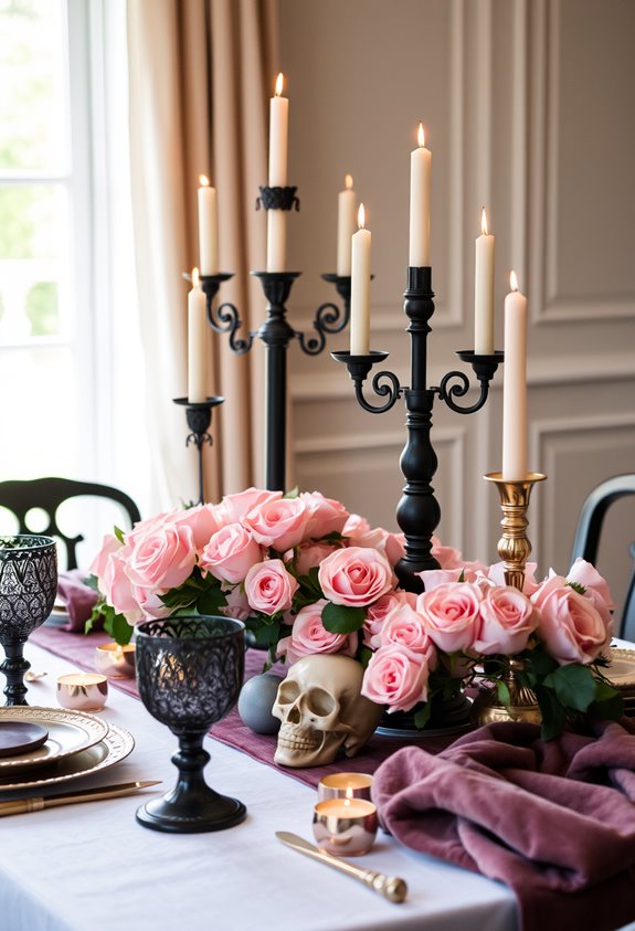
Blush pink and black shouldn’t work together for Halloween — and yet here we are. This palette is romantic gothic with a touch of glam, and it’s genuinely stunning. Black anchors everything. Blush pink softens it. Rose gold ties both together with metallic warmth.
Keep it tight — two to three colors max. Then repeat each one at least three times throughout your space so nothing feels accidental.
For your table, start with a black satin tablecloth and layer a pink lace overlay on top. Add black plates, gold chargers, and gold utensils. Pink taper candles in gold holders seal the deal.
Don’t forget the pumpkins. Black pumpkins with gold leaf. Blush pumpkins with rhinestones. Bats and skulls keep it unmistakably Halloween. You belong here.
For napkins, try deep pink linen folded into rose shapes paired with black napkin rings featuring skull motifs or baroque designs for a dark romantic finishing touch.
Purple, Teal, and Burgundy for a Jewel-Toned Halloween
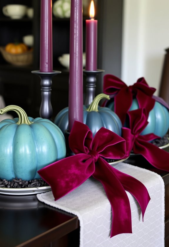
Deep purple is a Halloween classic. Pair it with black and you’ve got serious high-contrast drama. Teal keeps things fresh without touching that tired orange. Burgundy brings warmth and just enough vampire energy to feel intentional.
Spray-paint your skulls, pumpkins, and skeletons in these saturated hues. Add bold garlands, colorful candles, and rich textiles to layer the look. Then finish with gold accents. Gold makes everything feel more elevated and less “grabbed it on clearance.”
This palette works for modern glam, vintage spooky, and haunted house aesthetics. It belongs together. So do you. For a stunning focal point, try filling a skull vase with burgundy roses and callas for a refined floral display that feels intentional rather than accidental.
Hot Pink and Electric Blue for a Playful Halloween Twist
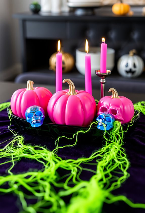
Hot pink and electric blue don’t exactly scream “subtle,” and that’s exactly the point. These two colors hit differently as accent-heavy choices rather than full-room saturation — and yes, that distinction matters. Dump them everywhere and you’ve got visual chaos. Use them strategically and you’ve got something genuinely cool.
The trick is grounding. Black or white anchors keep the palette readable, not overwhelming. Think black tablecloths with hot pink candles. White lanterns popped with electric blue accents. Small, deliberate choices.
Metallics — gold, silver, rose gold — sharpen the whole thing, adding polish without killing the energy. You’re not going subtle. You’re going intentional. There’s a difference. This palette says you belong to the crowd that refuses to take Halloween too seriously. Good.
Hot pink also pairs surprisingly well with orange and purple, meaning you don’t have to fully abandon traditional Halloween colors to make the look work.
Earthy Autumn Halloween Colors That Go Beyond Orange
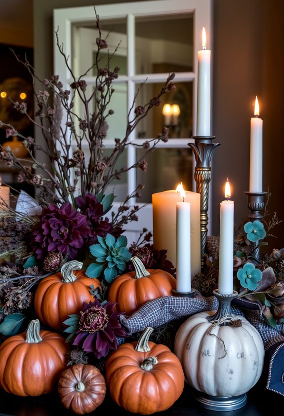
Muted olive and dark moss green add an understated spooky quality without screaming “costume store clearance bin.”
Muted olive and moss green whisper spooky rather than shout it.
Browns and wood tones create that cozy-yet-eerie atmosphere, especially when you’re working with natural materials and rustic textures.
Mustard yellow brings warmth.
Burgundy brings depth.
Rust and carmine keep the Halloween mood alive while shifting everything toward harvest territory.
The result feels welcoming.
Comfortable.
Like Halloween actually belongs in your home rather than just showing up uninvited and refusing to leave. These shades mirror the autumn palette’s natural association with harvest markets, changing leaves, and cozy interiors.
The Textures That Make Nontraditional Halloween Decor Feel Expensive
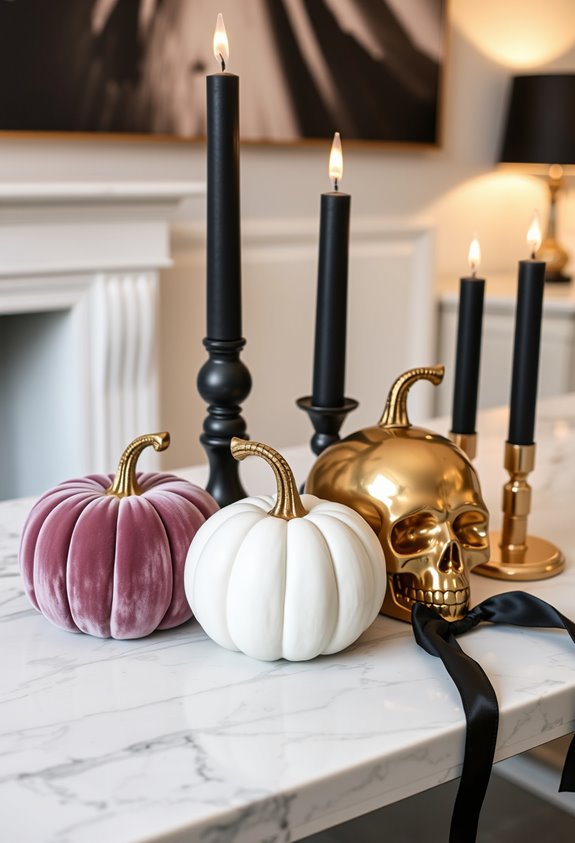
Once you’ve nailed the color palette, texture is what separates “intentional design” from “I grabbed whatever was left at Target on November 1st.” This is where the details do the heavy lifting.
Matte and satin finishes read as deliberate. Shiny plastic reads as cheap. Simple distinction, massive difference. Spray your candelabras black — matte or satin — and suddenly everything looks cohesive.
Then layer in contrast. Dried florals against smooth pumpkins. Wicker baskets near metallic accents. Rough wood trunks anchoring the whole composition. That friction between surfaces is what creates visual depth.
A discrete brass or silver element adds what designers call “quiet luxury.” It’s not flashy. It’s intentional. And intentional is exactly the vibe that makes people ask where you shopped — instead of what aisle you raided. To complete the composition, place plastic spiders and insects among your arrangements for a finishing touch that ties the whole Halloween aesthetic together.
Room-by-Room Halloween Styling for Colorful Decor Schemes
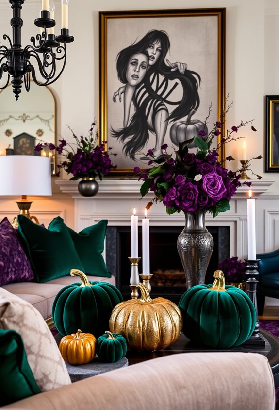
Each room in your house has a different job to do — and your Halloween decor should respect that. Your living room craves drama. Think midnight black, forest green, velvet sofas, layered lighting. Done.
The bedroom’s a different animal — it wants gothic purples, metallics, string lights, and cozy blankets that make it feel like a haunted sleepover. That’s actually a good thing.
Your kitchen? Go chaotic. Purple, neon green, black, orange — cauldrons on the counter, broomsticks tucked in corners, bats scattered around. Nobody said kitchens have to be boring.
And the dining room earns its moment with a spooky fabric runner, varied pumpkins, candles, and a crow sculpture that makes guests genuinely uncomfortable. Each room tells a different chapter of the same story. Swap in black pampas grass for your usual vase greenery to instantly push the Halloween atmosphere further without overdoing it.
DIY Tips for Keeping Your Halloween Color Scheme Cohesive
Styling every room is one thing — keeping it all from looking like a craft store exploded is another.
Start simple: two main colors, one accent. That’s it. The 60-30-10 rule works here — 60% dominant, 30% secondary, 10% accent. Don’t overthink it.
Repeat your colors intentionally. Sprinkle the same hues across rooms so nothing feels random. A shared motif — pumpkins, checks, ribbon — ties separate pieces together fast.
Test colors on scrap paper before committing. Seriously. It takes two minutes and saves real regret.
Keep a neutral anchor in every space. Black, white, taupe — something grounding. Without it, even beautiful palettes turn chaotic.
And check your palette under actual event lighting. Colors shift. What looks perfect at noon looks completely different at night. If you’re working with neon or bold shades, reach for alcohol-based markers or high-pigment paints to keep those vivid tones from falling flat on your decor elements.
Frequently Asked Questions
Can Colorful Halloween Decor Work for Both Indoor and Outdoor Spaces?
Yes, you can use colorful Halloween decor in both spaces! Indoors, you’ll love paper garlands and felt bats, while outdoors, giant spiders and glowing lanterns help you create bold, welcoming curb appeal.
Are Nontraditional Halloween Color Schemes Appropriate for All Age Groups?
You can absolutely rock nontraditional Halloween colors at any age! Softer lavender and blush suit kids, bold midnight blue and gold wow adults, and vintage purple-green wins every generation. Your perfect palette’s waiting!
How Do I Transition Colorful Halloween Decor Into Fall Thanksgiving Decor?
You’ll shift smoothly by removing spooky elements like skulls and cobwebs, keeping uncarved pumpkins, natural textures, and autumn textiles, then swapping in warm burgundy, gold, and cream accents that unite your community around harvest-season warmth.
Can I Mix Multiple Nontraditional Color Palettes Without the Decor Clashing?
You can absolutely mix nontraditional palettes without clashing! Start with two main colors and one accent, follow the 60-30-10 rule, and repeat colors throughout your space to keep everything feeling cohesive and intentionally curated.
Where Can I Buy Nontraditional Halloween Decor Beyond Typical Seasonal Stores?
You’ll find nontraditional Halloween décor at Etsy, Michaels, At Home, and Grandin Road. Don’t overlook thrift stores, antique markets, or Facebook Marketplace—these hidden gems connect you with unique pieces that reflect your distinctive, creative style.
Conclusion
Halloween doesn’t have to be a broken record of orange and black every single year. You’ve got options—real ones. Go jewel-toned. Go blush and gold. Go weird with hot pink. The rules weren’t that great anyway. Your home should reflect your style, not a bag of candy corn. Pick your palette, commit to it, and let the decor do the talking. Breaking tradition never looked this good.